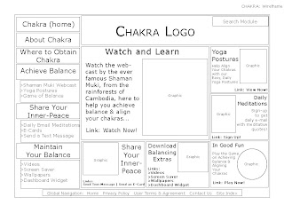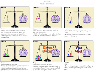
A work in progress I made for a group project to plan the event: Temple Advertising Department Awards.
More coming soon!


 NAME: Chakra


 My creative strategy for Green Ink is to create a fusion effect, and combining elements from two different realms. The primary elements used are that of edgy Americana. The secondary elements used, however, are eastern exotic. Combining these elements successfully will create a feeling of a worldly adventure for the target audience, while still keeping a sense of the comforting attitude that they are used to. My initial goal was to integrate this fusion feeling into all types of media, beginning with the mood board, and then following through into the billboard and the website as well. To enhance this fusion effect, I wanted to select my color palette and fonts carefully. So I made my selections based on hoping to reflect this fusion effect best. For the palette, I selected colors that were versatile for both sides. For the fonts, I selected one that reflected the eastern feel, one that reflected American edgy, and one neutral font for body copy. I also collected images that would influence my later decisions made in this project, knowing that I could also make use of them as well.